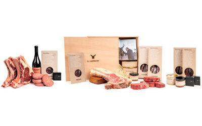
EL CAPRICHO’s new image

It has been many months since we began the difficult task of changing our product image, and looking back at the long road we have travelled, we are enormously satisfied with the results.
Many thanks to the design company Lavernia & Cienfuegos, which has managed to convert our wishes and desires into our new packaging, full of textures and sensations that will transport our clients to the pure essence of El Capricho. Using their words, we leave you with a small fragment that describes what we think.
We hope you like it!

“El Capricho is many things, but the key, the essence in matters of image, is its authenticity, its honesty, its power, its roots, and its attachment to the land and environment; a tradition, but a tradition that has evolved and is present in many of its manifestations with a clear and resounding modernity. That is why the packaging design tries to combine tradition and avant-garde, merging the austerity of traditional materials such as cardboard, string or fabric with the perception of packaging for gourmet products of the highest quality and a high price.
The packaging design is based on materials, on traditions, on a clear graphic design that does not mask anything, that does not distort the unique, direct, honest image that El Capricho transmits in its facilities, its service and in its products. Therefore, much of the packaging uses semi-handmade or woven cardboard boxes with a deliberately rustic appearance which contrasts with contemporary, simple but very powerful graphics and that communicates the idea of a signature product using phrases from José Gordón himself, the heart and soul of El Capricho. This use of the material – artisan cardboard, wood, string, fabrics – for a gourmet product is not only destined to transmit those values of authenticity, « terroir » and tradition, but also to provide an unusual consumer experience.”

